Tag Archives: #pdx

Twice As Nice: Two Vintage-Inspired Beer Can Designs

24 Jan

When Lompoc Brewing decided it was time to venture into can packaging for their beers, owner Jerry Fechter came to our meeting with clippings with several vintage beer cans. The commonalities were limited color palettes, easy-to-read type, and “premium” copy. With that as inspiration we came up with the Proletariat Red design keeping in mind its sales success could mean additional beers in the future can line-up. Lo and behold last fall we were able to put Lomporter Classic Porter out into the market while easily keeping true to our initial can design and brand and aesthetic priorities.

As with any sales initiative, product design needs to be followed with product promotion. Both beers were introduced with kickoff events requiring promotional posters, social media graphics, and merchandise including garments and pins. Additionally, Jerry asked me to come up with a newspaper ad announcing two great beers now available in cans. I presented five rough copy ideas for consideration. Rather than choosing just one, he opted to use all the ideas in consecutive weeks culminating with an ad size version of the Lomporter Friday the 13th event poster. The events were well-attended, the beers are on numerous retail shelves, and we’re set for new additions to the Lompoc beer can line-up.

*As always, click on the mosaic for a slideshow of larger images.

Six of One, Two Dozen of Another: Lompoc Brewing 6-packs and Cases

12 Sep

My work for Lompoc Brewing has spanned events, a collaboration, a label, and a bout with a surly marine mammal. Through it all we work really well together while managing to have a lot of fun resulting in solutions we are all proud of. However, I never cease to be surprised and flattered when a client brings me in on a high-level project. In this case, Lompoc’s move to package their flagship IPAs in 6-packs – a first for any of their beers.

Pamplemousse and C-Note IPA have been available in 22-ounce bottles featuring labels designed by WAAMCo for a few years now (large bottles in the images). My task – translate those labels into 6-pack carriers and cases. After a few meetings and research visits to supermarket beer aisles, it was decided early on to lighten up the overall feel for those two pieces. We pulled out the lightest and brightest colors of the original designs for the main floods while resizing and placing elements – including the awesome hop and monetary patterns – for all of the new formats. On the other hand, I needed to keep in mind that the labels for the new 12-ounce bottles were being resized from the originals by the label company with no changes to the color or content. To this end I kept the original circular badges intact on the end panels to maintain continuity from the carrier to its contents.

This was a new process for all of us and we are extremely happy with the results. My knowledge of dielines, drawdowns, and lead times has expanded with such a massive undertaking – I loved the opportunity to stretch and grow. And the best news of all – there’s more to come! Stay tuned!

*As always, click on the mosaic for a slideshow of larger images.

Evolution of the Saison (Label)

11 Jun

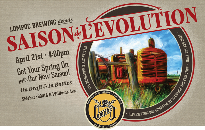
Design by Jen Lompoc Brewing Saison Beer Launch Poster Design

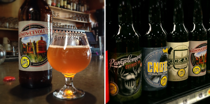
Design by Jen Lompoc Brewing Saison Beer Label Design

Another quick project post – this time for a beer label (!!). Lompoc Brewing came to me in need of a label design for their new seasonal, Saison de L’Evolution, French for “Evolution of the Season.” They knew they wanted the design to center around John Foyston’s painting of a tractor – it’s a Belgian-style Farmhouse Ale after all – which contributed to the choice of burlap as the overall label background. Historically, Lompoc’s labels have included a lot of texture – I wanted to honor that and stay consistent in the use of the centered circular format so that the new label could coexist nicely with its predecessors.

Shown are a couple of quick shots of the bottle in-situ and a graphic of the launch event poster illustrating the expansion on the label design for additional marketing usage.

*As always, click on the images to view larger versions.

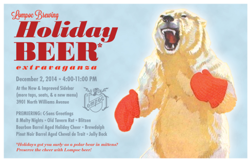
Lompoc Brewing Holiday Beer Poster

16 Dec

Lompoc 2014 Holiday Beer Poster

Instructions were to have fun with it… And indeed, it was one of the more fun projects I’ve worked on in awhile. What’s more fun than a holiday beer party and a surly polar bear in mittens?

*As always, click on the image for a larger view.

Just Another WordPress Site

11 Nov

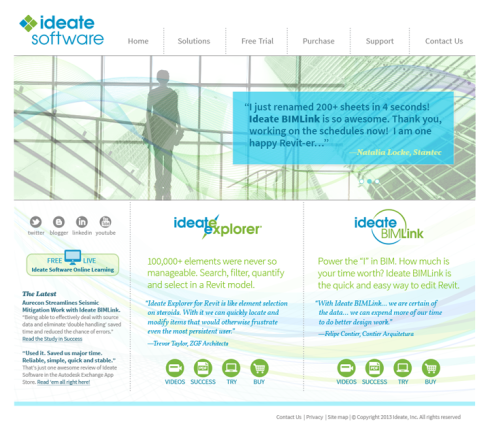
Ideate Software Web Site Design

Here’s a web site I designed for the WordPress platform for a 3rd party architectural software developer.

Additional Info:
In-House Project Client(s): Owner/CEO, Sales Director, Marketing Director, Operations Manager, Director of Software Development
Also Worked With: Web Developer, Copywriter, Software Engineers
Responsibilities Included: brainstorming, research, logo design, site layout and design, icon design, brand alignment, stock photo sourcing and purchasing

A Collaboration For Your Health! Cheers!

31 Jul

Last year my friend Bryan, head brewer at Lompoc Brewing, began his campaign to coerce me into a beer collaboration. Lompoc was in the thick of things with their Classic Rock IPA series that was to feature 11 (get it?) collaborations across the Pacific Northwest beer world. If I agreed, I would join the ranks of Fred Bowman, John Foyston and Jerry Fechter, Jack Harris, Brian Scheehser, and Hilda Stevens to name a few. And so you ask – as did I – how does Jen follow all those headlining acts? And why? What did I have to offer in the way of collaboration? Marquee status? Connections? Nope and nope. The other thing I got hung up on, predictably, was the name. If there was no concept-related tie-in to beer what was the point? Fred had conceived a white IPA titled the White Album. I watched as bands and hops were referenced: Cream, Foreigner, the Rolling Stones, Saaz, Nugs (& Rock ‘n’ Roll). I still dispute Poison as classic, but I get where she was going and she wins props for creating the only one still in production.

Months later at a Lompoc event, Bryan was still trying to convince me. Bands, songs, and oh yeah, how it might taste were discussed. Also, he had procured some hard-to-get hops from another brewery to appease my aversion to bitterness and my inclination toward citrus aroma. No pressure. Jack Harris only tried to steal them that one time. I had to admit I was pleased no one had referenced Led Zeppelin yet. They’re my favorite of the classics and no one used them. Actually, the missed opportunity was a little distressing. Though not distressing enough to outweigh the ‘opportunity’ to clean 900 pounds of spent grain out of a mashtun, Advil for days being my reward. I’d had my turns at Portland U-Brew and I knew brewing really wasn’t my, err, pint of pale.

Without committing I returned to my car and turned on the radio. Led Zeppelin’s Ramble On – one of my top Zep songs – was playing and I really listened to the lyrics. If it weren’t dark, I’m pretty sure the sun would have burst through the November clouds as Robert Plant sang, “And to our health we drank a thousand times, it’s time to Ramble On.” Light bulb. Sunburst. Angels singing. It suddenly added up to collaborate on this beer. I knew what I had to offer. I knew I could help market this thing. I’m a serial cheerser. It was one of my favorite songs by one of the greatest classic rock bands. It was the last beer in the series. It was truly time to Ramble On. I messaged Bryan. I was in.

And that’s how I ended up taking a day off in December to help brew 15 barrels of beer. No miracles in the way of suddenly wanting to become a brewer, but a fun day working with a good friend. The really fun part was designing the ‘show’ poster and supplementing it with social media to get people to the launch. The bonus? Coming away with a reminder of what I have to offer in the way of collaboration. But the really, really fun part? The IPA, of course! Cheers!

*As always, click on the mosaic for a slideshow of larger images.

August Break :: 8.30.13

31 Aug

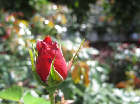
Design by Jen Rose Garden

I’m in Central Oregon with no access to wi-fi (might not even pack my laptop), so here’s another from beautiful downtown Portland. This may or may not be the final post of the August Break – we’ll see if I come home with anything. At any rate, it’ll definitely be September before I can post anything new.

Thanks for following along!


I’m participating in the August Break, but with my own take on the theme. I’d love it if you followed along! View the growing set all at once, if you wish.

August Break :: 8.29.13

30 Aug

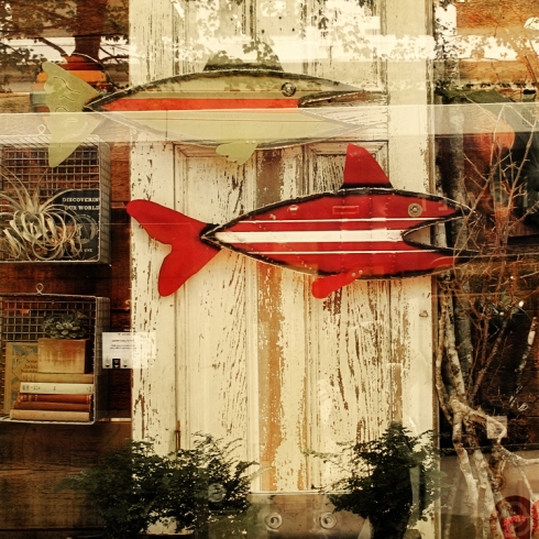
Design by Jen Red Fish

Lots to see. If you look.


I’m participating in the August Break, but with my own take on the theme. I’d love it if you followed along! View the growing set all at once, if you wish.

August Break :: 8.28.13 (b)

29 Aug

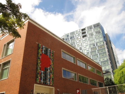
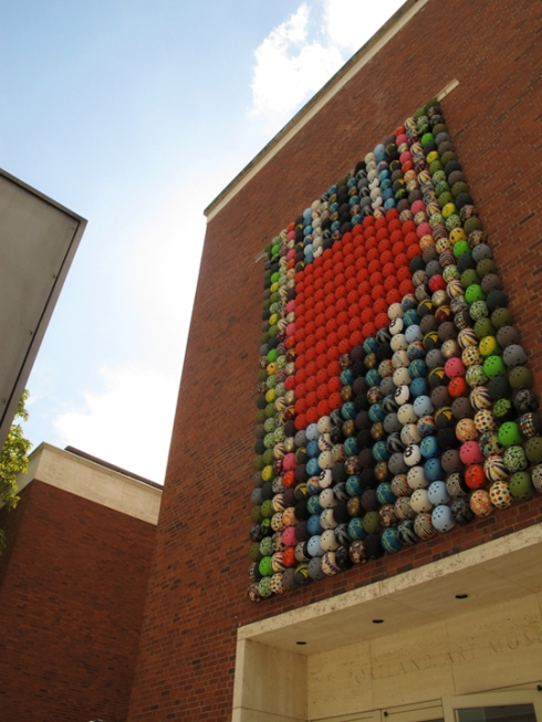
Design by Jen Porttland Art Museum

Design by Jen Porttland Art Museum

Here are a couple more from yesterday’s walk. If you look closely, you’ll see this is composed of helmets.

*(a) because I’m posting more from today, tomorrow (b).


I’m participating in the August Break, but with my own take on the theme. I’d love it if you followed along! View the growing set all at once, if you wish.

August Break :: 8.28.13 (a)

28 Aug

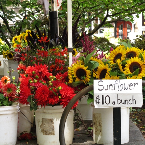
Design by Jen Farmers Market

Today. Today, the HTML climbed through the monitor and attempted to scratch out my eyeballs. Really.

And so. I declared, “I’m going for a walk!” And I did. And I was reminded. Of why. I do these monthly challenges. And I was grateful. For the push. For the excuse. And for this city. Its sounds. Piano players commanded to “Please play me.” Blocks cordoned off for lunchtime concerts. Its bustle. An art museum. A farmer’s market.  Its lavender smells wafting and reminding me of weekend adventures. Its colors. Its contrasts. The pausing. The tilting of the head. The peering around the corner. The what-if-I-looked-from-a-different-angle. The re-energizing of an afternoon.

*(a) because I’m posting more from today, tomorrow (b).


I’m participating in the August Break, but with my own take on the theme. I’d love it if you followed along! View the growing set all at once, if you wish.